Augmented reality wayfinding for Ulta Beauty
Ulta has around 1,380 US stores, and the layouts aren't consistent between them. This concept puts the store map in the customer's hand: directions to a product, a fallback when it's sold out, and a way to reach an associate without going to find one.
The problem
I shop at Ulta often enough to know where things are — and every location still surprises me. Between makeup, perfume, hair, and skincare, finding one specific product means walking every aisle or hunting down an associate. Plenty of customers just leave.
- Ease the searchGet a customer to a specific product without aisle-by-aisle hunting
- Never empty-handedSurface similar products, or the nearest store that has it
- Help, on requestCall an associate from where you're standing
- Promote in-storeGive people a reason to shop the aisle rather than the app
Does AR actually fit this audience?
Ulta's core demographic is 16- to 25-year-olds, so the honest question was whether in-store technology would land or annoy. The research said land: nearly half of shoppers in that bracket already prefer shopping in person, 35 percent say in-store technology improves the experience, and 41 percent of younger millennials stay in touch with their favourite brands while shopping via in-store tracking and notifications. Twenty-eight percent of older millennials reported interest in VR technology while shopping in store.
Customers are split roughly half and half between preferring online and in-person. AR is the one format that gives them both at the same time — the immediacy of a shelf with the certainty of a search box.
Three featured requirements
1. Directions to a product
A map feature that routes a customer to the exact product, shows how far away they are, and surfaces similar products along the way. If the item is sold out, it points to the nearest store that has it.
2. Similar products
When something is out of stock — or the customer just wants options — the app shows comparable items: different brands, similar shades, similar prices. The goal is that nobody walks out with nothing, and some people find a brand they didn't know.
3. Call for an associate
A button that alerts staff to the customer's location, confirms “an associate will be with you asap,” and offers product information inline first — answering the easy questions before anyone needs to walk over.
Interface and style guide
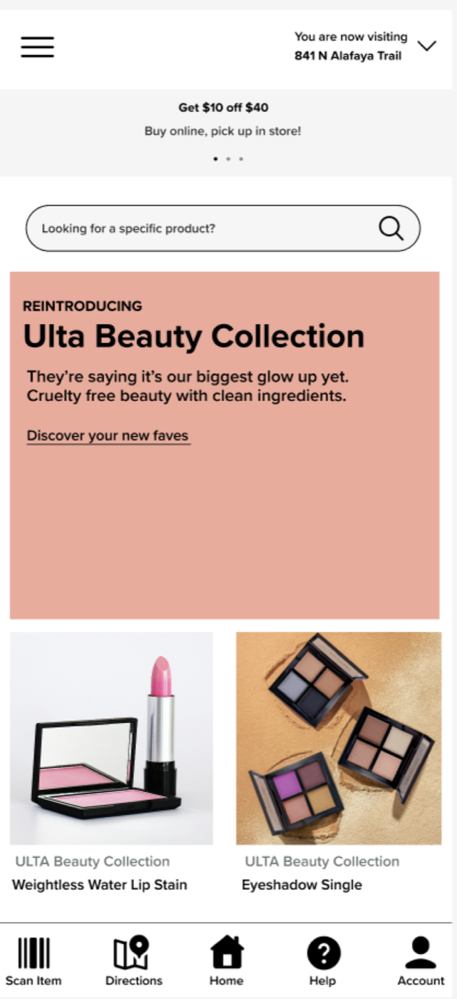
The UI keeps Ulta's own visual language — Proxima Nova, the brand's pink and black, the rewards messaging — and adds a persistent bottom bar with the three things this app exists to do: scan an item, get directions, get help. A style guide fixed the type scale and colour usage before the mockups, so the screens stayed consistent.
What I'd test next
The case study runs to the mockups; usability testing is the next step, not a finished one. Three features carry the whole idea, and each has a specific way it could fail in a real store:
Directions to a product
Test task completion in a live aisle: can someone reach a named product without asking for help, and how does the route hold up when the store is busy or the shelf has been reset since the map was drawn? The number worth tracking is the share of attempts that end at the right shelf, measured against a control group navigating without the app.
Similar products
The intent is that nobody leaves empty-handed, so the measure is whether a sold-out item still ends in a purchase. Substitution is a judgement call — a similar shade is not a similar price — and only a real test shows whether the suggestions read as helpful or as a consolation prize.
Call for an associate
This one has two users. The customer's measure is how long they wait; the staff measure is whether the alert volume is workable on a Saturday. If answering product questions inline doesn't cut the number of calls, the feature costs the store more than it returns.
The AR layer itself
Holding a phone up in a shop is a social act as much as a technical one. I'd want to know whether people actually raise the camera in a crowded aisle, or quietly fall back to the search box — and design for whichever answer comes back.
Where it landed
The concept ends with a coherent set of high-fidelity screens and a defensible case for why AR belongs in this particular retailer: a demographic that is comfortable with in-store technology, a store count large enough that layout inconsistency is a real cost, and three features that each remove a specific reason a customer gives up and leaves.
Project files
Opens in Figma, in a new tab.